15 of the Most Hilarious Holiday Design Fails
While trendsetters are busy taking a chic Scandinavian approach to their own minimal Christmas time – far from the touch of tacky – the rest of us are not so gifted, even designers. We can’t help but have bad design at the holidays. Whether it’s an eerie Santa, misspelled merchandise or creepy trees, there are tons of design fails worth revisiting as a bible of what not to do. From our headquarters to yours, here are the top hilarious holiday design fails that people have mostly not noticed until now. Most are from Reddit and Igmur, so props to their users for their keen eyes on the design fails.
1 The spooky ‘believe’ mug’

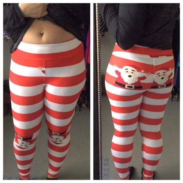
2 Santa’s hands on your tight pants

Another fashion designer with a questionable sense of humor or absentminded sewing job? We have a sinking feeling it is the former. Poor taste!
3 The ugly Christmas sweater with a hidden joke

This mom didn’t realize the design blip on this sweater she bought for her son. She writes: “Accidentally sent my son to school with his newly bought ugly Christmas sweater. Didn’t realize what Santa was doing until his kindergarten teacher pointed it out when I picked him up after school.”
4 Poop emoji Christmas tree

To know that this lit-up poopy tree was in a shopping mall somewhere in the middle of Bucharest boggles my mind.
5 The sign can be read two ways

Another extremely poor taste moment. “Santa, I’ve been a good girl, please stop” is meant to seem like Santa would stop to drop off gifts, but it can easily be read another way. And also, back off, Frosty.
6 Flickering lights with a bad font

It doesn’t look like it says ‘flickering.’
7 The butt plug Christmas tree

To imagine this in the center of a city square in Paris is just too much. It was taken down shortly after it was erected in 2014.
8 Misplacing the maple syrup

What designer could misplace the maple syrup directly underneath Santa’s crotch? I can’t. I just can’t.
9 Underpants Christmas lights

These lights hang like white underwear on a clothesline, except they’re in the middle of a street.
10 Talk about needing a fact checker

When a box design says four ornaments but they’re really only three. Sigh. Make sure you get the numbers right.
11 That’s not a tree

This Reese’s peanut butter Christmas tree looks more like a Moomin or a blob.
12 Just wrong

This children’s outfit bearing the phrase “Don’t open until Christmas” over the buttocks was designed by Hatley. But isn’t it an inappropriate slogan in an unlikely place? And to think Heather Reisman, the CEO of Indigo Books recommended it? That’s another thing entirely. Great team effort if the goal was creepy.
13 Santa’s laugh backwards: OH OH OH

Who played a mirror trick with this graphic designer’s screen? For the record everyone it’s HO HO HO. Don’t forget to pass it by the art director before going to print, please.
14 That does not look like a shoe

Where is the back end of this
giant high heel viewed from behind? Which is pegged between two Christmas ornaments? We have no idea what this shoe store had in mind when allowing the illustrator who designed this to put it up.
15 ‘Tis the Treason

Recommended Videos
 Mostly Described As The Pinnacle Of Avian Beauty Is A Dove Covered In A Mesmerizing Attire Of Burnished Gold And A Striking Yellow Sheen35 views
 Incredibly Powerful and Inexplicably Gorgeous Embroidery Tattoo Art87 views
-
Advertisements
 Bobo The Gorilla Has Made Best Friends With A Tiny Bush Baby164 views
 This 103-Year-Old Filipino Woman Is Trying To Keep This Ancient Tattoo Tradition Alive47 views
 These Rare Orchids Look Like Monkey Faces When They Bloom147 views
 Pictures Of Birds Who Look Like They’ve Just Been Divorced49 views
 10 of the Largest Living Things on the Planet88 views
 Hilarious Tumblr Posts Shared By “The Best Of Tumblr”85 views

